Aug 4, 2026Process
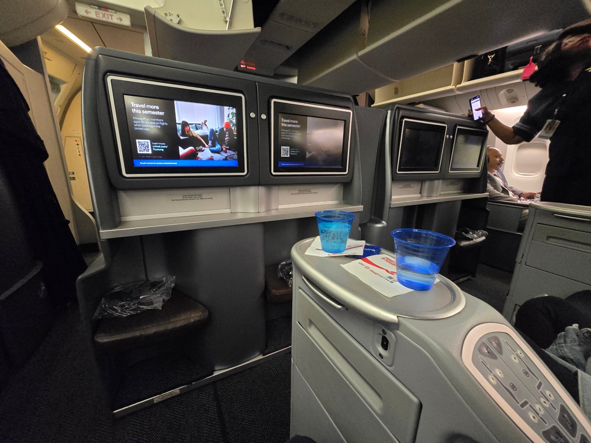
United Airlines updated experience
Going horizontal on an overnight flight is convenient but the experience can still be enhanced.
Read the noteNotebook
Notes on user-centric experience design, visual design, and research. Each entry is a lesson learned from real practice: research that changes minds, color systems that hold up, and layouts that breathe while being mindful of accessibility.
Going horizontal on an overnight flight is convenient but the experience can still be enhanced.
Read the note
Anchoring every hue to a lightness scale before picking chroma kept contrast ratios intact across both themes without a single manual override.
Read the note
Affinity mapping surfaced three real problems hiding behind eleven feature requests. Clustering first, naming second — never the reverse.
Read the note
Five sessions in ordinary rooms beat a lab study on budget and honesty. People behave differently when the chair is their own.
Read the note
Rounding a modular scale to the baseline rhythm removed the pixel-nudging phase entirely and made handoff notes almost unnecessary.
Read the note
Instead of adding weight to emphasise, we removed density around it. Comprehension scores rose while the component count dropped.
Read the note
Betty is a UX designer with 7+ years of dedicated UX experience and 15 years across enterprise, bringing outcome focus and problem framing to user and business challenges. She's a design system contributor and accessibility advocate who finds her purpose creating delightful experiences people are eager to return to. This blog is her working notebook: lessons from the field, visual experiments, and a systems-level take on the UX practice.
Read more about BettySunnyvale, California